HTML Responsive Web Design
What is Responsive Web Design?
Responsive Web Design makes your web page look good on all devices (desktops, tablets, and phones).
Responsive Web Design is about using HTML and CSS to resize, hide, shrink, enlarge, or move the content to make it look good on any screen:
Note: A web page should look good on any device!
Setting The Viewport
When making responsive web pages, add the following <meta> element in all your web pages:
This will set the viewport of your page, which will give the browser instructions on how to control the page's dimensions and scaling.
Here is an example of a web page without the viewport meta tag, and the same web page with the viewport meta tag:

Tip: If you are browsing this page with a phone or a tablet, you can click on the two links above to see the difference.
Responsive Images
Responsive images are images that scale nicely to fit any browser size.
Using the width Property
If the CSS width property is set to 100%, the image will be responsive and scale
up and down:

Notice that in the example above, the image can be scaled up to be larger than its original size.
A better solution, in many cases, will be to use the max-width property instead.
Using the max-width Property
If the max-width property is set to 100%, the image will scale down if it has to, but never scale up to be larger than its original size:
Show Different Images Depending on Browser Width
The HTML <picture> element allows you to define different images for
different browser window sizes.
Resize the browser window to see how the image below change depending on the width:

Example
<picture>
<source srcset="img_smallflower.jpg" media="(max-width:
600px)">
<source srcset="img_flowers.jpg" media="(max-width:
1500px)">
<source srcset="flowers.jpg">
<img src="img_smallflower.jpg"
alt="Flowers">
</picture>
Try it Yourself »
Responsive Text Size
The text size can be set with a "vw" unit, which means the "viewport width".
That way the text size will follow the size of the browser window:
Hello World
Resize the browser window to see how the text size scales.
Viewport is the browser window size. 1vw = 1% of viewport width. If the viewport is 50cm wide, 1vw is 0.5cm.
Media Queries
In addition to resize text and images, it is also common to use media queries in responsive web pages.
With media queries you can define completely different styles for different browser sizes.
Example: resize the browser window to see that the three div elements below will display horizontally on large screens and stacked vertically on small screens:
Example
<style>
.left, .right {
float: left;
width: 20%; /* The width is 20%, by default */
}
.main {
float: left;
width: 60%; /* The width is 60%, by default */
}
/* Use a media query to
add a breakpoint at 800px: */
@media screen and (max-width: 800px) {
.left,
.main, .right {
width: 100%; /* The width is 100%, when the viewport is 800px or smaller */
}
}
</style>
Try it Yourself »
Tip: To learn more about Media Queries and Responsive Web Design, read our RWD Tutorial.
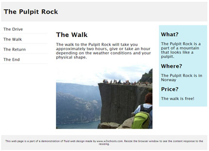
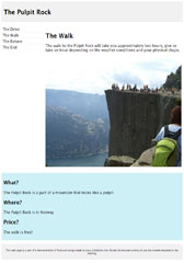
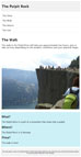
Responsive Web Page - Full Example
A responsive web page should look good on large desktop screens and small mobile phones.
Responsive Web Design - Frameworks
There are many existing CSS Frameworks that offer Responsive Design.
They are free, and easy to use.
Using W3.CSS
A great way to create a responsive design, is to use a responsive style sheet, like W3.CSS
W3.CSS makes it easy to develop sites that look nice at any size; desktop, laptop, tablet, or phone:
W3.CSS Demo
Resize the page to see the responsiveness!
London
London is the capital city of England.
It is the most populous city in the United Kingdom, with a metropolitan area of over 13 million inhabitants.
Paris
Paris is the capital of France.
The Paris area is one of the largest population centers in Europe, with more than 12 million inhabitants.
Tokyo
Tokyo is the capital of Japan.
It is the center of the Greater Tokyo Area, and the most populous metropolitan area in the world.
Example
<!DOCTYPE html>
<html>
<meta name="viewport"
content="width=device-width, initial-scale=1">
<link rel="stylesheet"
href="https://www.w3schools.com/w3css/4/w3.css">
<body>
<div
class="w3-container w3-green">
<h1>W3Schools Demo</h1>
<p>Resize this responsive page!</p>
</div>
<div
class="w3-row-padding">
<div class="w3-third">
<h2>London</h2>
<p>London is the capital city of England.</p>
<p>It is the most populous city in the United Kingdom,
with a
metropolitan area of over 13 million inhabitants.</p>
</div>
<div
class="w3-third">
<h2>Paris</h2>
<p>Paris is
the capital of France.</p>
<p>The Paris area is one of the largest
population centers in Europe,
with more than 12 million
inhabitants.</p>
</div>
<div class="w3-third">
<h2>Tokyo</h2>
<p>Tokyo is the capital of Japan.</p>
<p>It
is the center of the Greater Tokyo Area,
and the most populous
metropolitan area in the world.</p>
</div>
</div>
</body>
</html>
Try it Yourself »
To learn more about W3.CSS, read our W3.CSS Tutorial.
Bootstrap
Another popular framework is Bootstrap, it uses HTML, CSS and jQuery to make responsive web pages.
Example
<!DOCTYPE html>
<html lang="en">
<head>
<title>Bootstrap
Example</title>
<meta charset="utf-8">
<meta name="viewport"
content="width=device-width, initial-scale=1">
<link rel="stylesheet"
href="https://maxcdn.bootstrapcdn.com/bootstrap/3.3.7/css/bootstrap.min.css">
<script
src="https://ajax.googleapis.com/ajax/libs/jquery/3.2.0/jquery.min.js"></script>
<script
src="https://maxcdn.bootstrapcdn.com/bootstrap/3.3.7/js/bootstrap.min.js"></script>
</head>
<body>
<div class="container">
<div
class="jumbotron">
<h1>My First Bootstrap Page</h1>
</div>
<div class="row">
<div
class="col-sm-4">
...
</div>
<div class="col-sm-4">
...
</div>
<div
class="col-sm-4">
...
</div>
</div>
</div>
</body>
</html>
Try it Yourself »
To learn more about Bootstrap, go to our Bootstrap Tutorial.

