How To - Aspect Ratio / Height Equal to Width
THE WORLD'S LARGEST WEB DEVELOPER SITE
×

HOW TO

HowTo Home

Menus

Icon Bar Menu Icon Accordion Tabs Vertical Tabs Tab Headers Full Page Tabs Top Navigation Responsive Topnav Search Bar Fixed Sidebar Side Navigation Fullscreen Navigation Off-Canvas Menu Hover Sidenav Buttons Horizontal Scroll Menu Vertical Menu Bottom Navigation Responsive Bottom Nav Bottom Border Nav Links Right Aligned Menu Links Centered Menu Links Fixed Menu Slide Down Bar on Scroll Hide Navbar on Scroll Sticky Navbar Hover Dropdowns Click Dropdowns Dropdown in Topnav Dropdown in Sidenav Resp Navbar Dropdown Dropup Mega Menu Pagination Breadcrumbs Button Group Vertical Button Group Sticky Social Bar Responsive Header

Images

Slideshow Slideshow Gallery Modal Images Lightbox Responsive Image Grid Image Grid Tab Gallery Image Overlay Fade Image Overlay Slide Image Overlay Zoom Image Overlay Title Image Overlay Icon Image Effects Black and White Image Image Text Image Text Blocks Transparent Image Text Full Page Image Form on Image Hero Image Side-by-Side Images Rounded Images Avatar Images Responsive Images Center Images Thumbnails Meet the Team Sticky Image Flip an Image Shake an Image Portfolio Gallery Portfolio with Filtering Image Zoom Image Magnifier Glass Image Comparison Slider

Buttons

Alert Buttons Outline Buttons Split Buttons Animated Buttons Fading Buttons Button on Image Social Media Buttons Loading Buttons Download Buttons Icon Buttons Next/prev Buttons Block Buttons Text Buttons Round Buttons Scroll To Top Button

Forms

Login Form Signup Form Checkout Form Contact Form Social Login Form Register Form Form with Icons Newsletter Responsive Form Clear Input Field Copy Text to Clipboard Animated Search Search Button Fullscreen Search Custom Checkbox/Radio Custom Select Toggle Switch Check Checkbox Password Validation Toggle Password Visibility Multiple Step Form Autocomplete

Filters

Filter List Filter Table Filter Elements Filter Dropdown Sort List Sort Table

Tables

Zebra Striped Table Responsive Tables Comparison Table

More

Fullscreen Video Modal Boxes Timeline Scroll Indicator Progress Bars Skill Bar Range Sliders Tooltips Popups Collapsible Calendar HTML Includes To Do List Loaders Star Rating User Rating Overlay Effect Contact Chips Cards Profile Card Alerts Notes Labels Circles Coupon Responsive Text Fixed Footer Sticky Element Equal Height Clearfix Snackbar Scroll Drawing Sticky Header Pricing Table Parallax Aspect Ratio Toggle Like/Dislike Toggle Hide/Show Toggle Text Toggle Class Add Class Remove Class Active Class Zoom Hover Transition on Hover Arrows Shapes Browser Window Custom Scrollbar Device Look Placeholder Color Vertical Line Animate Icons Countdown Timer Typewriter Coming Soon Page Chat Messages Split Screen Testimonials Quotes Slideshow Closable List Items Typical Device Breakpoints Draggable HTML Element Trigger Button on Enter JS Media Queries Syntax Highlighter JS Animations Get Iframe Elements

Website

Make a Website Make a Website (W3.CSS) Make a Website (BS3) Make a Website (BS4) Center Website Contact Section

Grid

2 Column Layout 3 Column Layout 4 Column Layout Expanding Grid List Grid View Mixed Column Layout Blog Layout

Google

Google Maps Google Maps BW Google Translate Google Charts Google Fonts

Converters

Convert Weight Convert Temperature Convert Length Convert Speed

How TO - Aspect Ratio


Learn how to maintain the aspect ratio of an element with CSS.
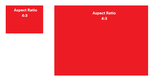

Aspect Ratio

Create flexible elements that keep their aspect ratio (4:3, 16:9, etc.) when resized:

What is aspect ratio?

The aspect ratio of an element describes the proportional relationship between its width and its height. Two common video aspect ratios are 4:3 (the universal video format of the 20th century), and 16:9 (universal for HD television and European digital television).


How To - Height Equal to Width

Step 1) Add HTML:

Use a container element, like <div>, and if you want text inside of it, add a child element:

Example

<div class="container">
  <div class="text">Some text</div> <!-- If you want text inside the container -->
</div>


Step 2) Add CSS:

Add a percentage value for padding-top to maintain the aspect ratio of the DIV. The following example will create an aspect ratio of 1:1 (the height and width is always equal):

Example 1:1 Aspect Ratio

.container {
    background-color: red;
    width: 100%;
    padding-top: 100%; /* 1:1 Aspect Ratio */
    position: relative; /* If you want text inside of it */
}

/* If you want text inside of the container */
.text {
    position: absolute;
    top: 0;
    left: 0;
    bottom: 0;
    right: 0;
}
Try it Yourself »

Other aspect ratios:

Example 16:9 Aspect Ratio

.container {
    padding-top: 56.25%; /* 16:9 Aspect Ratio */
}
Try it Yourself »

Example 4:3 Aspect Ratio

.container {
    padding-top: 75%; /* 4:3 Aspect Ratio */
}
Try it Yourself »

Example 3:2 Aspect Ratio

.container {
    padding-top: 66.66%; /* 3:2 Aspect Ratio */
}
Try it Yourself »

Example 8:5 Aspect Ratio

.container {
    padding-top: 62.5%; /* 8:5 Aspect Ratio */
}
Try it Yourself »